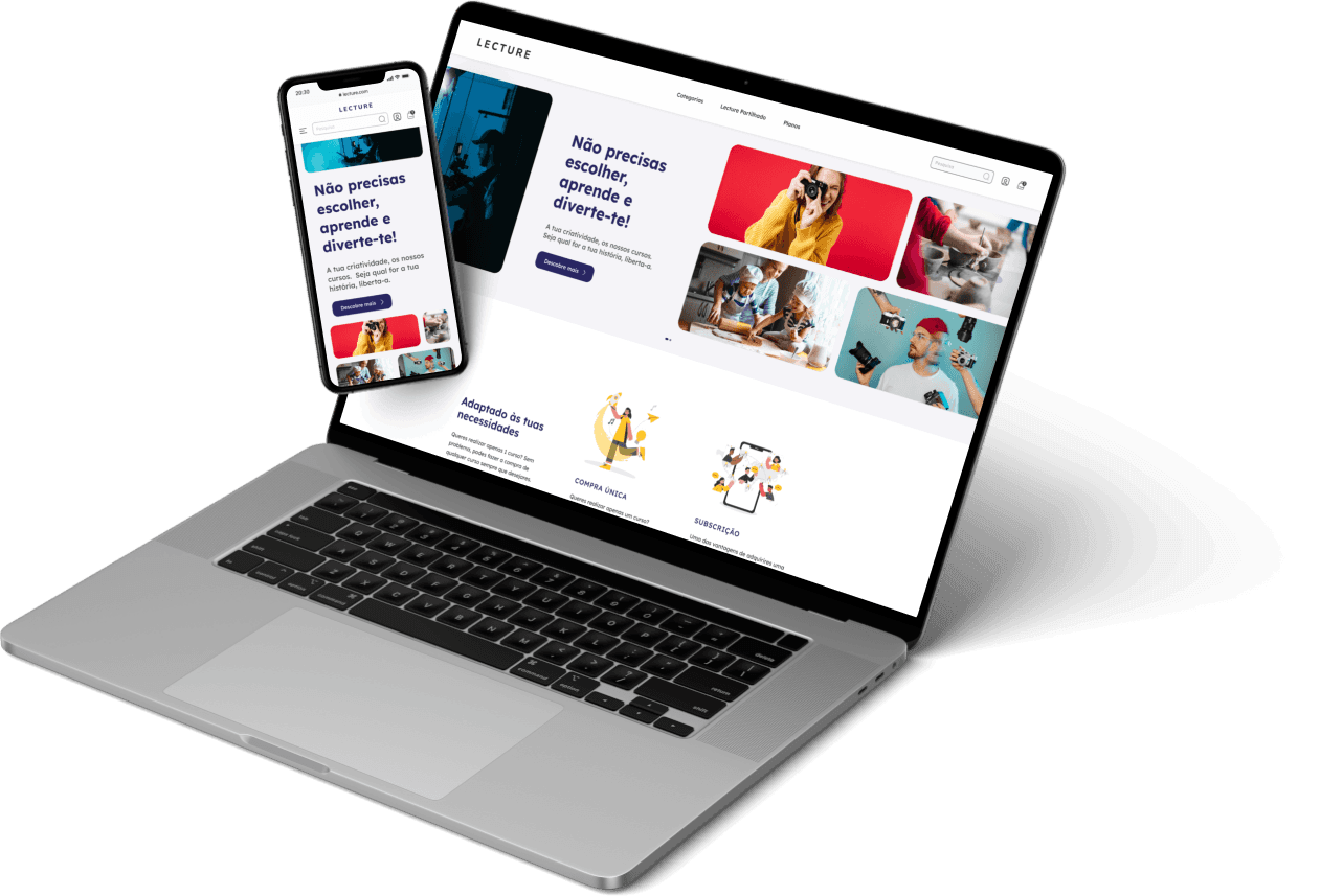
Online Course Platforms (Case study)
Developed over 17 weeks at school, after work, with Marina Mascaretti in the UX Ui Design course at EDIT Porto.I'll show you the various steps I consider relevant to the project conclusion: prototypes developed for mobile and desktop.
School:
Tools:

Online course platform
(case study)
Developed over 17 weeks at school, after work, with Marina Mascaretti in the UX Ui Design course at EDIT Porto.I'll show you the various steps I consider relevant to the project conclusion: prototypes developed for mobile and desktop.
School:
Tools:

Online course platform
(case study)
Developed over 17 weeks at school, after work, with Marina Mascaretti in the UX Ui Design course at EDIT Porto.I'll show you the various steps I consider relevant to the project conclusion: prototypes developed for mobile and desktop.
School:
Tools:


Briefing
The challenge
With this project, we're creating a platform where all the courses from all the categories are grouped together, and students get updates about new courses that match their interests. It's also possible to see who the professors are, what themes and modules it has, and other stuff.
All students will be able to buy all the courses they want, but we want to encourage you not to take multiple courses at the same time, so that they can focus on acquiring all the knowledge that is transmitted in a more immersive way.
The purpose of LECTURE is to be a learning reference platform accessible to all.
We want to show that the act of creating can mean growth, change and discovery in people's lives. We want to inspire and multiply creativity and promote expression and learning.
Estrutura
Fluxo de trabalho
01 - Research & Analysis
• Benchmarking • Surveys and Research • User Personas
02 - Ideation & Development
03 - Lecture • Share the knowledge


Estrutura
Estrutura
Estrutura
Fluxo de trabalho
Fluxo de trabalho
Fluxo de trabalho
01 - Pesquisa & Análise
— Benchmarking
— Inquéritos e Investigação
— User Personas
01 - Pesquisa & Análise
• Benchmarking
• Inquéritos e Investigação
• User Personas
01 - Pesquisa & Análise
• Benchmarking
• Inquéritos e Investigação
• User Personas
02 - Ideação & Desenvolvimento
— Estratégia de conteúdo
— Proposta de valor: 'Lecture Partilhado'
— WireFrames
— Testes de usabilidade
02 - Ideação & Desenvolvimento
• Estratégia de conteúdo
• Proposta de valor: 'Lecture Partilhado'
• Arquitetura de informação
• Fluxo de utilizador
• WireFrames
• Testes de usabilidade
02 - Ideação & Desenvolvimento
• Estratégia de conteúdo
• Proposta de valor: 'Lecture Partilhado'
• Arquitetura de informação
• Fluxo de utilizador
• WireFrames
• Testes de usabilidade
03 - LECTURE
— Design System
— Mockup Desktop
— Mockup Mobile
03 - Lecture - Partilha o conhecimento
• Design System
• Mockup Desktop
• Mockup Mobile
03 - Lecture - Partilha o conhecimento
• Design System
• Mockup Desktop
• Mockup Mobile
01
01
01
Pesquisa & Análise
Pesquisa & Análise
Pesquisa & Análise



Benchmarking
Benchmarking
'Comparative Assessment' - Strategic analysis of 3 reference players in the market. An important factor for developing the business plan and content strategy.
'Comparative Assessment' - Strategic analysis of 3 reference players in the market. An important factor for developing the business plan and content strategy.
'Comparative Assessment' - Strategic analysis of 3 reference players in the market. An important factor for developing the business plan and content strategy.
(Only available desktop version)
Surveys and Investigation
Surveys and Investigation
Surveys and Investigation
With the aim of consolidating and validating certain information, we conducted a survey through a questionnaire, from which we obtained relevant and intriguing results.
With the aim of consolidating and validating certain information, we conducted a survey through a questionnaire, from which we obtained relevant and intriguing results.
With the aim of consolidating and validating certain information, we conducted a survey through a questionnaire, from which we obtained relevant and intriguing results.
(Only available in Desktop version)


very important data in validating the concept.
very important data in validating the concept.
very important data in validating the concept.


User Personas
User Personas
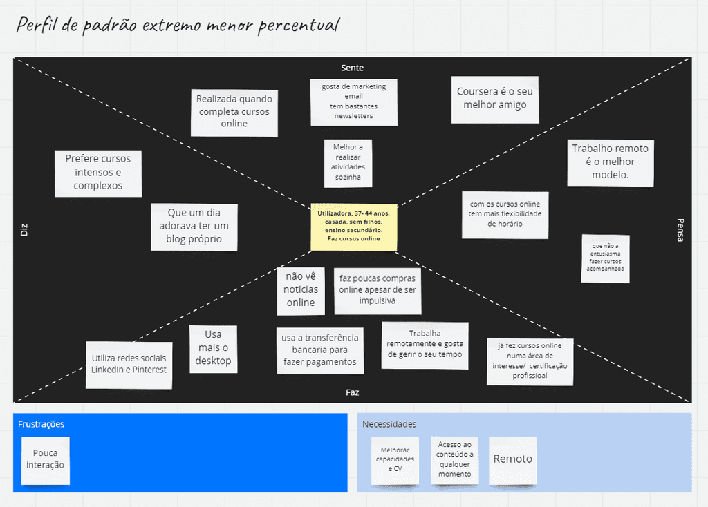
Combining the questionnaire results with benchmarking analysis, we created two personas that represent the most common profiles of our e-learning platform users. These insights were valuable for us to personalize our services and adapt our strategy, ensuring a quality and personalized experience.
Combining the questionnaire results with benchmarking analysis, we created two personas that represent the most common profiles of our e-learning platform users. These insights were valuable for us to personalize our services and adapt our strategy, ensuring a quality and personalized experience.
Combining the questionnaire results with benchmarking analysis, we created two personas that represent the most common profiles of our e-learning platform users. These insights were valuable for us to personalize our services and adapt our strategy, ensuring a quality and personalized experience.
(Only available desktop version)
Common points

👍 Spend more quality time with friends and family;
👎 They feel overwhelmed by the number of courses and online options.
02
02
02
Idea & Development
Idea & Development
Ideation & Development



Content strategy
Content strategy
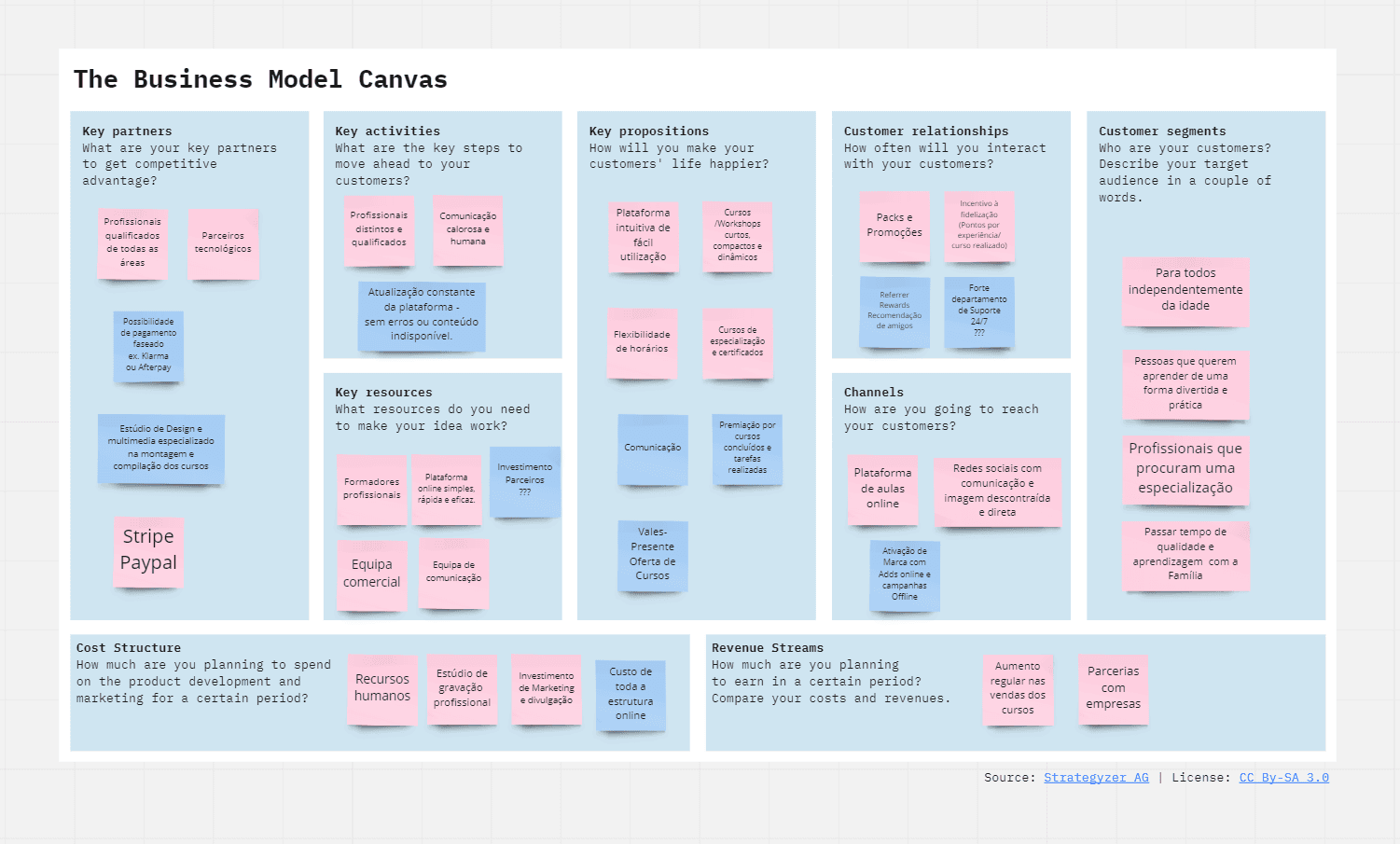
To develop a successful strategy, it is essential to answer crucial questions that provide valuable insights into the market. The 'empathy map' was one of the methods used to obtain results.
To develop a successful strategy, it is essential to answer crucial questions that provide valuable insights into the market. The 'empathy map' was one of the methods used to obtain results.
To develop a successful strategy, it is essential to answer crucial questions that provide valuable insights into the market. The 'empathy map' was one of the methods used to obtain results.
(Only available desktop version)
(Only available desktop version)
Value proposal:
'Shared Lecture'
Value proposal:
'Shared Lecture'
With a detailed analysis of what already exists in the market, we have developed the "Shared Lecture" feature, with the aim of providing our users with a completely innovative and excellent educational experience.
With a detailed analysis of what already exists in the market, we have developed the "Shared Lecture" feature, with the aim of providing our users with a completely innovative and excellent educational experience.
With a detailed analysis of what already exists in the market, we have developed the "Shared Lecture" feature, with the aim of providing our users with a completely innovative and excellent educational experience.
(Only available desktop version)



Information architecture
Information architecture
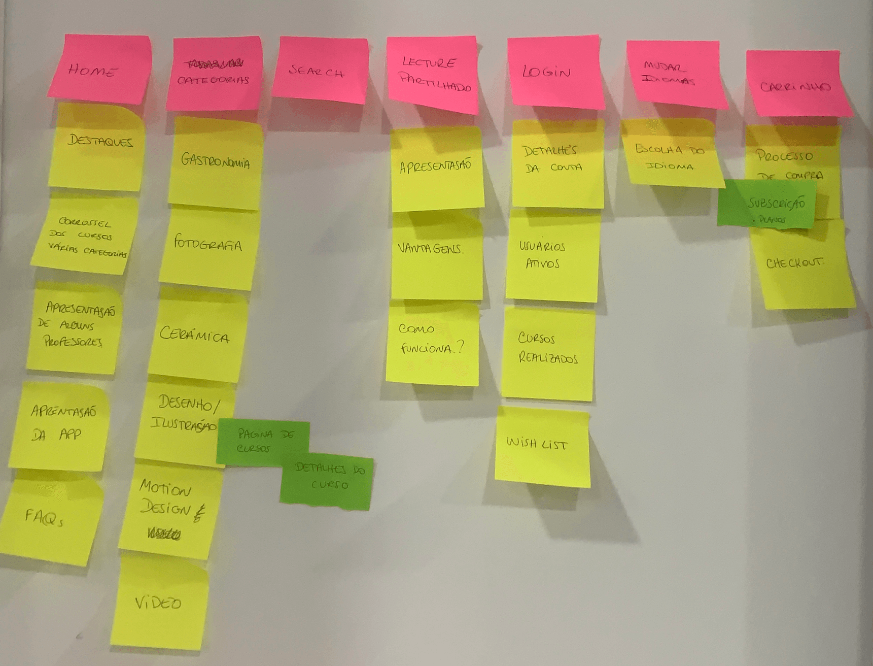
Information architecture is critical to ensuring that information is organized clearly and efficiently. It helps define the structure, hierarchy and navigation of the content, which in turn improves the user experience and increases their understanding of the content.
The 'HMW - How-Might-We' was one of the methods used to speed up the effective development of the structure of the entire platform.


User flow
User flow
In order to provide users with a pleasant and intuitive user experience, we started the process of creating User Flows. We used the information obtained through previous research and concentrated on the elaboration of the 'Happy Path', having in mind the main objective of developing a pleasant, simple and intuitive platform for users.
In order to provide users with a pleasant and intuitive user experience, we started the process of creating User Flows. We used the information obtained through previous research and concentrated on the elaboration of the 'Happy Path', having in mind the main objective of developing a pleasant, simple and intuitive platform for users.
In order to provide users with a pleasant and intuitive user experience, we started the process of creating User Flows. We used the information obtained through previous research and concentrated on the elaboration of the 'Happy Path', having in mind the main objective of developing a pleasant, simple and intuitive platform for users.
(Only available desktop version)
(Only available desktop version)


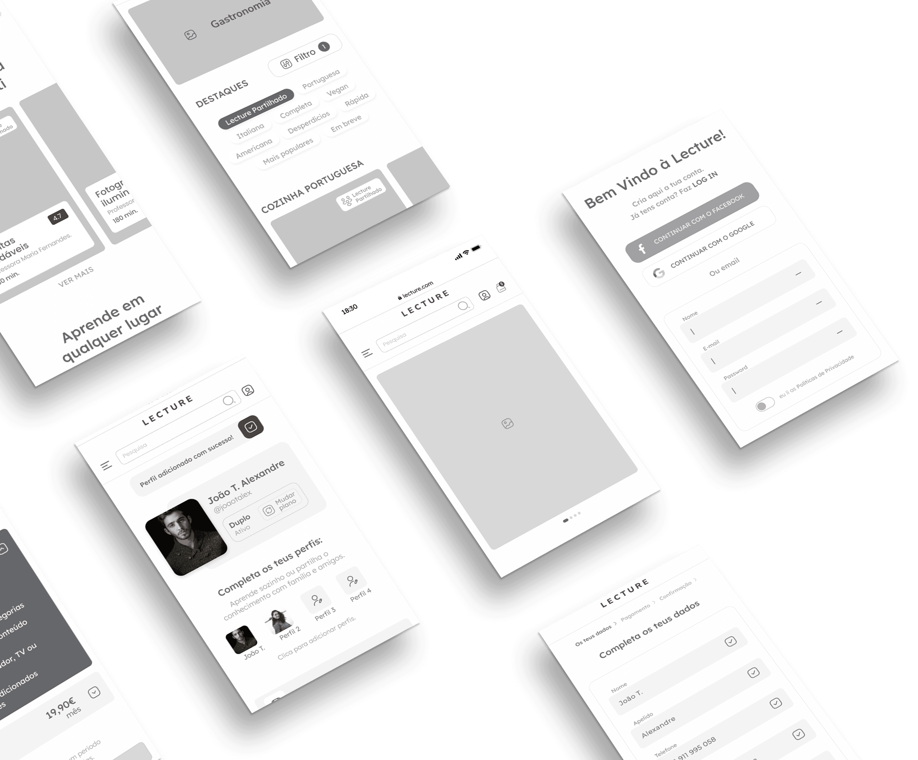


Wireframes
Wireframes
By using wireframes, it was possible to conduct tests and experiment with various layouts, navigation flows, and functionalities in a preliminary manner, before dedicating time and resources to the complete design development. This process contributed to greater efficiency in planning and development, resulting in time and resource savings, as well as ensuring an optimized user experience from the beginning of the process.
By using wireframes, it was possible to conduct tests and experiment with various layouts, navigation flows, and functionalities in a preliminary manner, before dedicating time and resources to the complete design development. This process contributed to greater efficiency in planning and development, resulting in time and resource savings, as well as ensuring an optimized user experience from the beginning of the process.
By using wireframes, it was possible to conduct tests and experiment with various layouts, navigation flows, and functionalities in a preliminary manner, before dedicating time and resources to the complete design development. This process contributed to greater efficiency in planning and development, resulting in time and resource savings, as well as ensuring an optimized user experience from the beginning of the process.
(Only available desktop version)
(Only available desktop version)
Usability testing
Usability testing
After completing the creation of our wireframes, we began usability testing to assess the effectiveness and ease of use of our product. We conducted tests with four different users to identify any usability issues and gather feedback on how to improve user experience. Participants were given a specific task to perform, while their interactions and feedback were observed and recorded. Using the collected information, we significantly improved our product and were able to provide an exceptional user experience.
After completing the creation of our wireframes, we began usability testing to assess the effectiveness and ease of use of our product. We conducted tests with four different users to identify any usability issues and gather feedback on how to improve user experience. Participants were given a specific task to perform, while their interactions and feedback were observed and recorded. Using the collected information, we significantly improved our product and were able to provide an exceptional user experience.
After completing the creation of our wireframes, we began usability testing to assess the effectiveness and ease of use of our product. We conducted tests with four different users to identify any usability issues and gather feedback on how to improve user experience. Participants were given a specific task to perform, while their interactions and feedback were observed and recorded. Using the collected information, we significantly improved our product and were able to provide an exceptional user experience.
(Only available desktop version)
(Only available desktop version)

03
03
03
Lecture
Partilha o conhecimento
Design System
Design System
The development of the Design System for the Lecture platform was a complex and challenging process, but extremely important to ensure a consistent and cohesive user experience across the platform. We considered several factors, including the brand's visual identity. The result was a complete design system, which includes guidelines for typography, colours, icons, buttons, and other interface elements.
The development of the Design System for the Lecture platform was a complex and challenging process, but extremely important to ensure a consistent and cohesive user experience across the platform. We considered several factors, including the brand's visual identity. The result was a complete design system, which includes guidelines for typography, colours, icons, buttons, and other interface elements.
The development of the Design System for the Lecture platform was a complex and challenging process, but extremely important to ensure a consistent and cohesive user experience across the platform. We considered several factors, including the brand's visual identity. The result was a complete design system, which includes guidelines for typography, colours, icons, buttons, and other interface elements.
(Only available desktop version)
(Only available desktop version)

Lecture Mobile - Protótipo
Lecture Mobile - Protótipo
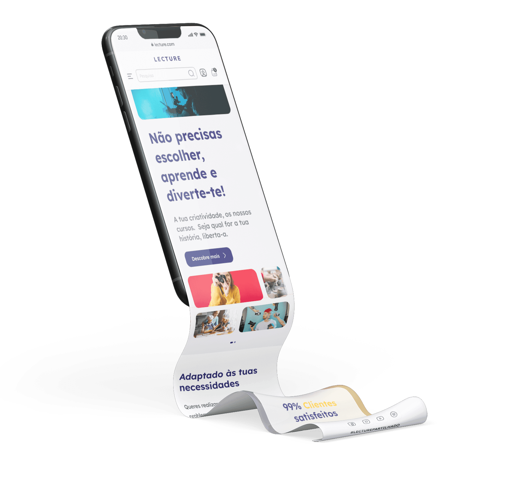
With the increased use of mobile devices to access the internet, it is essential for Lecture's website to have a mobile version that offers a pleasant and intuitive user experience. With this in mind, we have developed a mobile prototype that meets the needs of our users and offers smooth and efficient navigation. On the right side, the prototype is fully functional.
With the increased use of mobile devices to access the internet, it is essential for Lecture's website to have a mobile version that offers a pleasant and intuitive user experience. With this in mind, we have developed a mobile prototype that meets the needs of our users and offers smooth and efficient navigation. On the right side, the prototype is fully functional.
With the increased use of mobile devices to access the internet, it is essential for Lecture's website to have a mobile version that offers a pleasant and intuitive user experience. With this in mind, we have developed a mobile prototype that meets the needs of our users and offers smooth and efficient navigation. On the right side, the prototype is fully functional.


Protótipo Figma
Protótipo Figma
Tal como nos Wireframes, o 'happy path' continua a ser subscrever o plano Duplo e de seguida adicionar um utilizador ao perfil.
Tal como nos Wireframes, o 'happy path' continua a ser subscrever o plano Duplo e de seguida adicionar um utilizador ao perfil.
Tal como nos Wireframes, o 'happy path' continua a ser subscrever o plano Duplo e de seguida adicionar um utilizador ao perfil.
(Only available desktop version)
Lecture Desktop 🚀
Lecture Desktop 🚀
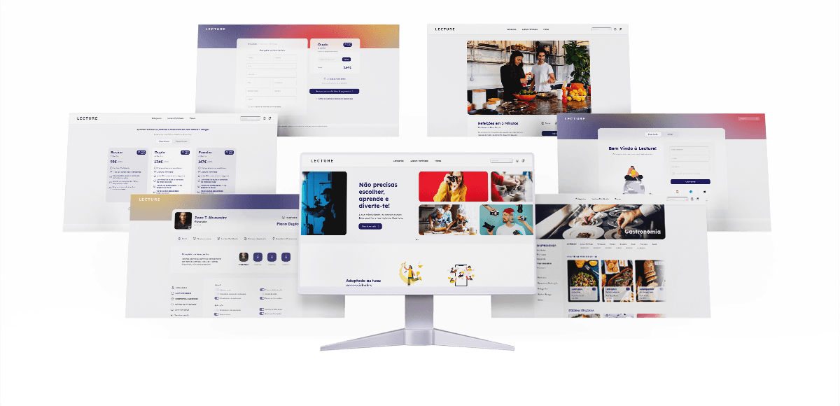
In order to provide a more complete and dynamic user experience, special attention was given to the development of the Desktop version of the Lecture platform. Great care was taken when creating the layout and navigation of the website, in order to make it clear, user-friendly and easily navigable. This structure allows users to effortlessly locate information & features they require. The outcome of this is a solid platform that has the capacity to fulfil the requirements of a large and demanding audience.
As with Wireframes, the 'happy path' continues to be subscribing to the 'Duplo' plan and then adding a user to the profile.
(Only available desktop version)